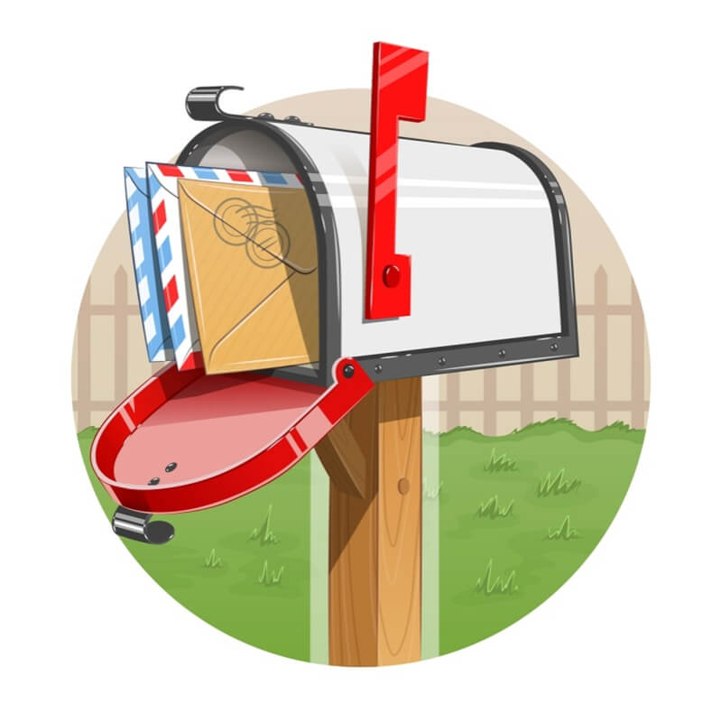
Generally, demanding someone’s attention is often frowned upon by society. But, in the case of a direct mail marketing campaign, catching a prospect’s eye is mandatory for success. You not only want to grab your customers’ attention initially. You also want to sustain it so that they take action.
For such a tall order, you need a couple of tricks up your sleeve.
Personalize It
Marketing studies have confirmed it time and time again: when direct mailers are personalized, response rates rise. Today’s customers want to feel like your company knows them personally and that you understand them and their unique needs. Make them feel like a part of your extended family by using their first names. Personalization extends beyond name, however. Use other characteristics you know about the customer, such as their age, marital and family status, geographic area, and shopping history.
Create a Sense of Urgency
The more time your direct-mail materials spend on the countertop or desk, the less likely your customers will take action. Suggest to your customer’s that they “must” buy, sign up, or visit now by adding a sense of urgency to your headlines and call-to-actions. Do this by placing expiration dates on offers or rewards. Tell them it’s their “last opportunity” to save, or that supplies are limited.
Change Dimensions
There’s more than one way to do this. You can step away from the traditional letter-sized mailer in favor of something smaller or larger. Large mailers, in particular, are more likely to be noticed and read. Or, you can print materials outside of the customary square or rectangle shape. You might also use dimension to insert something special into your typical letter mailer, like a magnet or pen.
Use Compelling Colors and Fonts
Color grasps attention much better than boring black and while materials. Incorporate your brand colors and attractive fonts into your mailer to catch the customer’s eye. This doesn’t give you permission to go crazy with colors and text, though. Stick with one or two colors that build brand recognition as well as one or two fonts. Your design might also include attention-getting images that make the customer look again, such as a star burst or a ticking clock.
Personalization, urgency, different sized and shaped mailers, and compelling colors and fonts are terrific ways to make your direct mail stand out. Implementing all four or even just one of these direct-mail marketing tricks is sure to get your customers’ attention.
For more tips or help with your own direct-mail marketing efforts, contact The frank Agency today!


